
"What's New" Archives: April 2012
April 24, 2012:
April 11, 2012:
April 7, 2012:
Easter Cuteness from Walt Kelly
April 5, 2012:
Through Glass, Darkly
We're learning more about the Philip Glass opera based on Peter Stephan Jungk's wretched novel about Walt Disney, The Perfect American, and what we're learning is fulfilling my worst fears. You can follow this link to an article at the website of the British newspaper The Guardian.
The link to my site within the article leads to the comments on my most recent post about The Perfect American. To go to the post itself, follow this link.
April 11, 2012:
Kelly's Mystery Caricatures
One of the many pleasures in re-reading Walt Kelly's comic-book output from the 1940s, which I've been doing recently, is recognizing the truth of what Hank Ketcham said to me about Kelly: “He was a great observer of people and various funny types that you’d see all over the city, and he could put that down in a drawing very nicely.”
Often, it seems obvious that a character is not just an impression of some real person Kelly saw on the street, but a caricature of someone Kelly knew well and enjoyed bringing to life on the comics page. The great Disney animator Ward Kimball, Kelly's good friend, turns up in at least two stories (and later in the Pogo Sunday page). "Gentleman John," unmistakably John Stanley, appears in the Kelly story in the October 1946 Our Gang Comics, and another cartoonist colleague, Dan Noonan, has a bit part in that same story. I've spotted Oskar Lebeck, Kelly's editor, in one very early story, in Camp Comics, and a lantern-jawed crook called "Deacon," who had a repeating role in Our Gang Comics, looks like a particularly wicked caricature of Tom Oreb, Kelly's former colleague at the Disney studio.
Then there are the characters who must be based on real people—but which real people? In that October 1946 Our Gang story, amid caricatures of Stanley, Noonan, and Kelly himself, there's a blue-eyed salesman, introduced a few issues earlier, who demands identification as a caricature, but I have no idea of whom. Someone Kelly knew at Disney? A friend at Western Printing? Likewise “Siwash Susie,” a diminutive barroom singer—could she be Oskar Lebeck’s secretary, Anne DeStefano?
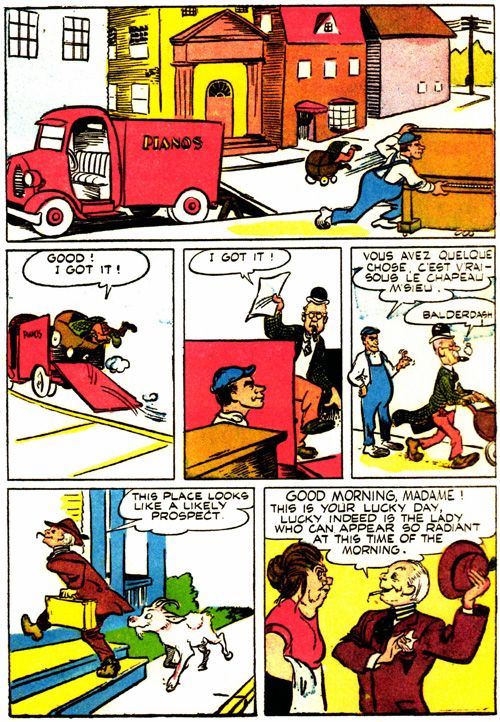
And what about the short, fat, pipe-smoking man in mismatched clothing, who was caricatured not just by Kelly but by John Stanley in New Funnies? Someone they both knew at Western, presumably, but who? (He appears in the July 1946 Our Gang Comics alongside "Deacon.") And what about the piano mover in the March-April 1946 Our Gang Comics—the same issue that saw the first appearance of the blue-eyed salesman—who for some tantalizingly obscure reason bursts into French for one panel?
Here are a few pages with reasonably good views of some of these mystery caricatures (taken from Fantagraphics' Our Gang reprint volumes, must-buys for Kelly fans who don't own the original comic books). If any of these people look familiar, please let me know. First the pipe smoker and Deacon (and another crook, probably not a caricature, called Oxtail), from the July 1946 Our Gang Comics:
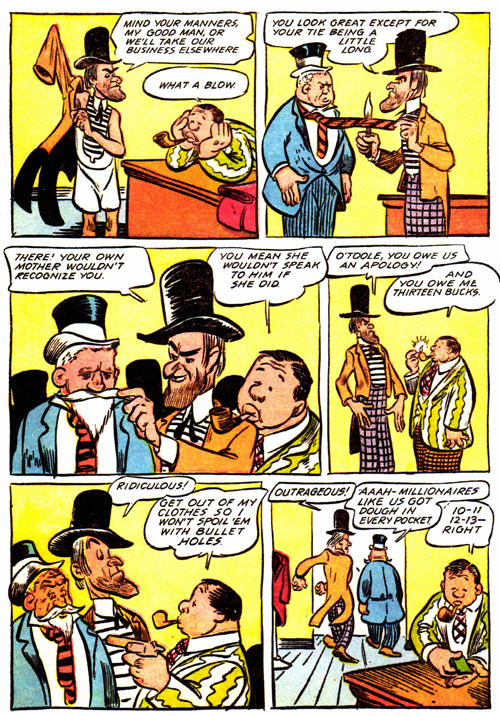
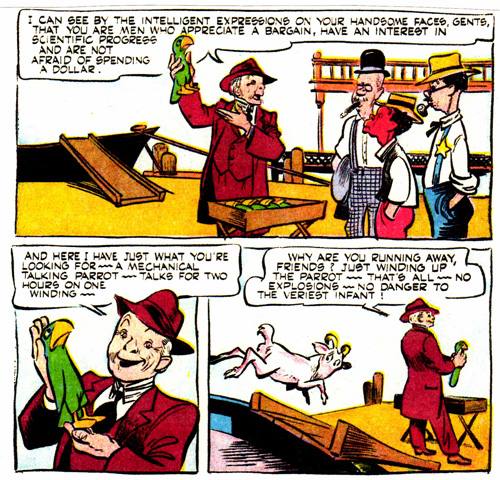
And here's the French-speaking piano mover (he's saying, in a literal translation, "You have something, that's true, under the hat, mister") and the blue-eyed salesman, from the March-April 1946 Our Gang Comics:
And here's another view of the salesman, from the October 1946 Our Gang. The rube at the right, the one wearing a badge, is Kelly himself; he also turns up later in the story, as a Yiddish-accented cook.
An April 17, 2012, update: After trolling through a lot of Western Printing's internal publications, I've tentatively identified that "blue-eyed salesman" shown above as a broad caricature of Richard Small, a long-time Western employee. Small was, according to a 1958 item in The Westerner, the company's house organ, "active in the sales and management phases of the Newsstand Division in New York City and Poughkeepsie, and as an officer and director of Artists and Writers Guild, Inc., and K.K. Publications, Inc., subsidiaries" before becoming assistant manager of Western's Poughkeepsie plant. He was named manager at Poughkeepsie in 1958. All such identifications are still open to question, of course.
A May 5, 2012, update: Amid Amidi, who probably knows more about Tom Oreb than anyone else writing about animation, has questioned my suggestion that the lantern-jawed crook in the panels above might be a caricature of Oreb: "I can't say for sure, but the character you've identified as Tom Oreb doesn't look anything like Oreb to me. It's definitely a poke at someone specific, but I wouldn't know who."
I've been wondering more and more if the strong individuality of so many of Kelly's characters—so much in contrast to the comic-book norm—might be a snare. That is, Kelly's characters look like real people; but does that mean they are real people? Not necessarily. Given Kelly's speed and facility, I can easily imagine his seeing someone on the street who catches his interest, making a sketch on the spot or immediately afterwards, and then transforming that sketch into a full-blooded character who seems to be a caricature but really isn't. Alas, although some comments by Hank Ketcham point in that direction, I don't know of any specific examples of such transformations.
A September 22, 2012, update: Thanks to Bob Barrett, I can now state with certainty that the pipe-smoking "O'Toole" in some of the panels above is definitely Morris "Moe" Gollub, who was, with Kelly, John Stanley, and Dan Noonan, one of Oskar Lebeck's mainstays in the last half of the 1940s. Here's how Stanley caricatured Gollub in a "Woody Woodpecker" story in the September 1946 issue of New Funnies:
From Kirk Nachman: Fun to see the collegial subtext from Kelly in these pages. Tho' I confess I find the interior work of this era of Kelly's comic-book output to be his shabbiest, whereas his covers and a handful of splash panels from this period are exquisite examples of his style at its closest to the world of Golden Age animation, before his maturity, hatching and spotting on Pogo ever after. I'm amazed someone like yourself, who might be found reading the libretto of La Traviata, actually reads these comics. I've always found comicbook imagery and the impressionistic "reading" one may gather in following the panels visually, to be a delight, however am astounded when the literary merits of such stories are taken in serious consideration. As a man stretched between high and low, with no evidence to abolish the distinction, you are a puzzle, monsieur. But we must remember The Magic Flute was written for the children of vulgar theater, and is now regarded as a masterpiece of high culture.
[Posted April 17, 2012]
Assorted Shorts
Benzon on Bugs: Bill Benzon, whose work you'll find represented on this site in essays on Fantasia and Dumbo, has been intrigued recently by What's Opera, Doc? and by the questions it may raise about the nature of animated comedy of the Warner Bros. kind. I sometimes feel when I read Bill's pieces that he is taking a long way around when a more direct route is available, but what the hey, he's doing intellectual work that almost no one else writing about animation is doing. I've just read through his What's Opera, Doc? postings, and my reaction could be summed up as impatience, followed by second thoughts along the lines of, wait a minute, there are some ideas here that really deserve a careful look. See for yourself by going to Bill's blog, New Savanna. You can go straight to an index of what he has written about short cartoons by clicking on this link.
Bringing Lutz to Light: Everyone who cares about animation history knows about E. G. Lutz's seminal 1920 book Animated Cartoons: How They Are Made, Their Origin and Development, but you can't have known as much about the book and its history as J.J. Sedelmaier, the New York-based animation producer. He has written a wonderful, richly illustrated post about Lutz and his books—there were seventeen of them—for Print magazine's imprint blog. Even better, Martin De Cicco has posted a comment on J.J.'s post that provides far more detail about Lutz's life than we've had before. (Most of what I'd known about Lutz came from disparaging comments by contemporaries like Dick Huemer and George Stallings.) And let me also recommend J.J.'s earlier post on Albert Hurter and He Drew as He Pleased, the beautiful book made up of Hurter's inspirational sketches for the Disney cartoons.
Puss in Boots. I finally got around to watching DreamWorks Animation's Puss in Boots for the first time the other night, in Blu-ray. I felt some slight hope that it might be worth watching, but it's surpassingly dreadful, a robotic compendium of CGI clichés. Like almost all such films, it's overloaded with expensive star voices that talk entirely too much, a pseudo-John Williams score that punches way too many emotional buttons, and elaborate action sequences that invite admiration only as feats of precision engineering. Does anyone who works on this stuff long to work on something better, or has everyone at DreamWorks kidded themselves into thinking that a movie as awful as Puss in Boots is actually pretty good? It's the latter thought that's really scary.
Cathy Freeman's book. I've written several times here about George Sherman, the Disney studio's late head of publications, and his daughter, Cathy Sherman Freeman. George Sherman was, you'll recall, the recipient of the one of the small paintings of Uncle Scrooge that Carl Barks gave to a favored few friends. Cathy Freeman has now written a memoir called A Disney Childhood: Comic Books to Sailing Ships (Bear Manor Media) about what it was like to grow up as the daughter of a Disney executive, and about her life after her father's lamentably early death (at age 45). It's available through amazon.com and, I'm sure, other outlets.
From Bill Benzon: I took your bemused remark about my round-about ways as an opportunity to make an observation or two about method. Thanks for your interest and support.
[Posted April 12, 2012]
April 7, 2012:
Easter Cuteness from Walt Kelly
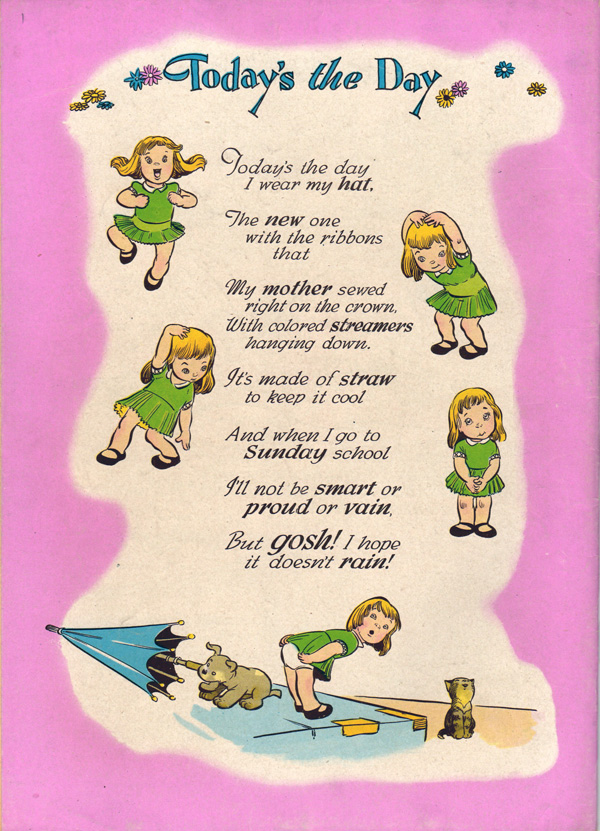
From the back cover of Easter With Mother Goose, Four Color Comic No. 140, 1947.
April 5, 2012:
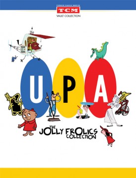
UPA on DVD
 When I read glowing praise for the UPA cartoons, I remember watching one of Stephen Colbert's wonderful "interviews" with a hapless member of Congress. "George W. Bush," Colbert said to his baffled victim. "Great president? Or greatest president?"
Likewise, in some animation circles the range of acceptable opinion about UPA seems to range from "great Hollywood cartoon studio" to "greatest Hollywood cartoon studio." Snarl that it was considerably less than either, and you risk spending a cold night on the porch. I summarized my porch-worthy thoughts about UPA in Hollywood Cartoons: American Animation in Its Golden Age:
UPA left an extraordinarily small legacy of first-rate cartoons—fewer than a dozen, even at a generous estimate, all of them made in a two- or three-year span in the early fifties, and most of them owing their stature to [John] Hubley's contribution. ... There was at the heart of most of the UPA films only a catalogue of prohibitions (against talking animals, against violence) and what amounted to a sample book of very tasteful decorative patterns.
Such skepticism is of course why Hollywood Cartoons is not one of the books about UPA recommended in a booklet accompanying the Jolly Frolics Collection, the new three-DVD set encompassing 38 UPA cartoons. (The set includes all of the Columbia releases except for most of the Mister Magoos, which will be released separately this summer). I don't think very many animation fans still care a great deal about UPA, but those who do are ferociously intolerant of heresy.
UPA's mystique has persisted even though, or more likely because, so many of the cartoons have been hard to see, or to see in adequate prints, a lack remedied spectacularly by the new set. I wish it were in Blu-ray, but even as DVD transfers most of the cartoons look wonderful. I've been able over the years to see a great many of the UPA cartoons in 35mm Technicolor prints, but other people have not been so fortunate, and the new set gives them the opportunity to see the cartoons as they should be seen. Whether UPA's reputation will be enhanced or diminished as a result is an open question.
I could write about individual films, but I've already said most of what I'd want to say in Hollywood Cartoons, in a chapter on UPA from 1944 to 1952. To save repeating myself, I'm posting that chapter here, at this link, with a few frame grabs I've appropriated from Cartoon Brew and Leonard Maltin's blog. (I've also removed the endnotes and made a few minor changes in wording.) I'm happy to have you compare this chapter, as to its comprehensiveness, accuracy, and critical point, with the parallel chapters in Maltin's Of Mice and Magic and Amid Amidi's Cartoon Modern, two of the three books recommended in the new DVD set. The third recommended book is Adam Abraham's When Magoo Flew: The Rise and Fall of Animation Studio UPA, a newly published history; I expect to write about that book soon.
My chapter ends with Hubley's Rooty Toot Toot, for my money the only truly great UPA cartoon and, as it happens, the cartoon that ends the first of the three DVDs. The post-Hubley cartoons that make up the remaining two discs are for the most part very weak by comparison. I write about that period in UPA's history, including Hubley's firing and the other effects of the blacklist, in the opening pages of the next chapter of Hollywood Cartoons, which I haven't reproduced here. You'll just have to read the book!
A final note: Although, as I say, most of the cartoons look wonderful, Mark Kausler cautions that "some are marred by being 'hard-matted' to 1:85 aspect ratio, like the Ham and Hattie cartoons and The Rise of Duton Lang." You'll know exactly what he means when you look at the cartoons. Fortunately, I don't think anyone will find such shortcomings disqualifying when they're deciding whether to purchase the new DVD set.
Oh, and should you buy it? Yes, by all means, if only to reward Turner Classic Movies for its enterprise in bringing neglected cartoons so splendidly back to life. And who knows, after watching the UPA cartoons you may decide that I really do deserve to be kicked out onto the porch.
From Don Benson: I enjoyed this set much the same way I enjoyed the Chaplin at Keystone set: Most of the time you're very aware you're watching experiments, some that will pay off elsewhere and, for better or worse, end up shaping the industry.
The trouble is, there's a limited amount of actual comedy in Chaplin delivering the then-standard quota of random violence. He seems destined to evolve into the Three Stooges, if that. Even the fabled Tillie's Punctured Romance is primarily people kicking each other, with the occasional jolt of Chaplin or another performer smuggling in a flash of character. The fascination comes from a close familiarity with what Chaplin DID become, and catching the baby steps (and missteps) in that direction.
Likewise, looking at the UPA cartoons you see the templates for Hanna Barbera's "grownup" sitcoms, Paramount's very affected "Modern Madcaps", late-period Looney Tunes (especially the Chuck Jones/Maurice Noble work), nearly everything animated for television and a few generations of commercials. UPA was usually a bit better animated and designed, but their visual style was soon run into the ground by imitation. And inevitably, the imitators often managed to improve and expand on UPA's experiments (the "Ham and Hattie" shorts now feel like somebody aping Jay Ward without Ward's writing staff).
There's the rub: Successful innovators tend to look old-fashioned in a hurry, because imitators not only make the breakthrough a standard but put a polish on it through their own innovations and/or simple repetition A modern audience viewing Jolly Frolics just as cartoons is only going to see talky old sitcoms slightly enlivened by nifty '50s designs. Which is a bit sad, because UPA was making important steps with the handicaps of studio executives, paranoid politics and generally conservative mass audience. Getting Middle America to embrace Mr. Magoo was a bigger deal that we can now appreciate.
That said, if I'm trying to win a novice over to vintage animation, there are only a few UPAs I'd show. Just as I'd show very few actual Keystones when making a case for silent comedy.
[Posted April 5, 2012]
From Gene Schiller: Regarding Don Benson’s comments, which are mostly right on the mark, the UPA style was not run into the ground, so much as it became the industry standard for many, many years. That is not a small thing. Even today, on viewing Disney’s Tangled, it’s the 2-D end credits, with the UPA inspired caricatures, that rock my boat, rather than anything in its 3-D "virtual reality" world.
[Posted April 9, 2012]
From Vincent Alexander: I enjoyed rereading your chapter on UPA (particularly after having recently re-watched most of the cartoons you mentioned), and I think it’s certainly clear that Hollywood Cartoons should’ve been recommended in the booklet. Negative or not, what you wrote is the most in-depth description of the studio’s history that I’ve ever read. If the DVD was intended to be a mainstream release then I could see why they wouldn’t link to a book that was generally skeptical of the studio’s output, but since film buffs and animation enthusiasts are the only ones who are going to be interested in the DVD anyway, I think they would be able to handle a different perspective. Then again, most of them are probably already familiar with your book (hopefully).
I seem to fall somewhere in the middle on these UPA debates - there are a handful of the cartoons that I really love, whereas the bulk of them are nice-looking but otherwise pretty empty. They certainly opened up the possibilities of what could be done in cartoons, but they never quite followed through on their potential. I consider John Hubley to be one of the greatest animation directors of all time, but most of his best work (The Adventures of an *, The Tender Game, Moonbird, etc.) was done once he left the studio. Still, I have a lot of respect for UPA and I’m very glad that the studio’s work is finally available on DVD.
I think it’s interesting that, aside from John Hubley’s films, most of the great cartoons the studio produced were based on the work of outside talent like James Thurber, Edgar Allen Poe and Dr. Seuss. The films based on stories by those writers may have their flaws (The Tell-Tale Heart feels a bit rushed, and the score in A Unicorn in the Garden isn’t the best), but they are still great examples of the marriage between good writing and sophisticated visuals.
More often you get something like The Oompahs, which has a fun, experimental look coupled with a story that seems like an afterthought. Take away the instruments in that cartoon and what you have is a pretty simplistic morality tale, with very little attention given to character (you never feel particularly sorry for the young horn even when he falls sick) or humor (the groaner that ends the short is a good example). And having the narrator describe to us what’s going on and what we’re supposed to be thinking throughout the whole cartoon is a nuisance (the visuals should be strong enough to carry the story without such interference). Compare it to the Silly Symphony short Music Land (a cartoon many of the UPA artists probably would’ve sneered at) and you’ll notice that the earlier cartoon is much more clever in its usage of instruments as characters and props. The Oompahs doesn’t even stay consistent with its own setup, at one point bringing a dog into its all-instruments world. That’s just one cartoon, but many of the shorts have a similar lack of attention to story and character. There are a handful of UPA cartoons that avoid these pitfalls (Georgie and the Dragon, Wonder Gloves and Christopher Crumpet work pretty well), but not very many.
That said, though, I’m very much enjoying the DVD collection. The restorations are beautiful, and the really nice prints reveal that even weaker entries like The Miner’s Daughter and Ballet-Oop have a lot to offer. There are even several cartoons on the set that I’ve never seen (I haven’t quite reached the end of the DVD yet), so I’m really looking forward to them. Thus far, the only ones I haven’t found much enjoyment in at all are the three directed by Art Babbitt, who didn’t seem to get the concept of stylized animation (a cartoon like Giddyap almost feels like one of those mediocre DePatie-Freleng cartoons from the late ‘60s, where the attractive layouts are wasted on cheap animation and unfunny characters like the Blue Racer and Sheriff Hoot Kloot). Overall, though, the fantastic presentation has really changed my mind about a few of the cartoons, even if Rooty Toot Toot and Gerald McBoing-Boing are still the only two flawless masterpieces.
From Kevin Hogan: I have always felt that the argument that UPA was the forerunner of television style animation is grossly overstated. As you have often stated, there is a difference between stylized animation and cheap animation. A heavily stylized cartoon, if made for a purpose, can be just as costly as a “fully animated” cartoon. I believe television cartoons would have come about, with equal cheapness, with or without UPA.
With that said, I like a great many UPA cartoons, but it is often times (I think) due to my taste for modern style and satirical stories (well, they seem to be trying to be satirical, with few but Rooty Toot Toot succeeding). While I want to argue with you, Michael, you are pretty much right in Hollywood Cartoons. ….Come on, they look so pretty!
A last thought, with Mr. Alexander’s bringing up Moonbird and the later Hubley couple cartoons. Is anyone else bored by these cartoons? The highly stylized and innovative use of textures are nice, but the literal animation and the rambling dialog just bores me. Everyone on these blogs seems to love these cartoons, and I just don’t get it. Am I wrong?
MB replies: I'm not a great fan of the later Hubley films; I can't talk myself into believing that Faith was a positive influence. I'm afraid she succeeded mostly in turning John Hubley into an approximation of Bobe Cannon. I prefer what I think of as the real John Hubley, the tougher-minded artist who made Rooty Toot Toot.
[Posted April 11, 2012]
From Thad Komorowski: On Kevin Hogan's comment dismissing the idea that UPA was a forerunner to early TV animation... Yes, that is perhaps a tad overstated. It's plain cartoons would have evolved the way they did without UPA's existence. (Unlike, say, Disney's earliest sound cartoons. The technical level of those films is nothing short of amazing, and I doubt that animation could have flourished without them.) The modern art style was popular and would have infiltrated the studios, albeit at a slower pace. Flatter and less movement is just the way to go when your budgets get slashed, no crazy mystery (see Walter Lantz's films after he reopened in 1950 for a case in point, before UPA really got popular). UPA's ideology of the designer being king as a forerunner to today's overseas system is a whole different story, however...
[Posted April 13, 2012]
From Kevin Hogan: I could not agree more about the Lantz cartoons of the early '50s … Michael, do you know of any real “modernist” influence on the Lantz studio in the early '50s (outside of the studio's awareness of the other studios around them)? I don’t think there really was, although I don’t have the research to back that up…
I think Hanna-Barbera at MGM in the '50s is a case in point. I don’t see a major or immediate change in the style of the Tom and Jerry cartoons in the early to mid '50s. The characters (most emphatically Tom) gradually became simplified—less detail in the fur, the removal of excess colors in the character designs (ex. the white line between Tom’s eyes), the overall “rounding” of the characters into simple curves. The backgrounds, like other studios, gradually become more abstract… I think MGM gradually cheapened the cartoons until HB saw how minimal audience standards were becoming. Take a look at a late '50s Tom and Jerry design and then look at Huckleberry Hound—there isn’t much of a difference.
UPA gave the other studios an excuse to simplify their designs. Instead of calling their cartoons cheap, they called them modern. Just look at the Modern Madcap Cartoons at Paramount. The cartoons there were simply cheap and minimal—there was really nothing “modern” (in the higher sense of the style) about them.
While on the subject of Modern Madcaps—I saw The Plot Sickens last night and it was hands down the worst cartoon I have ever watched. It was sick in a Family Guy “Disturbing Images = supposedly funny gag” type of way. Truly awful.
MB replies: I can't think of anyone at Lantz in the '50s who might have been a "modernist" influence. In my own experience, I think singling out any one of the Modern Madcaps as "the worst" is problematic, because they're so uniformly terrible.
[Posted April 18, 2012]
From Thad Komorowski: Re: Kevin Hogan's question about "modernism" at the other studios. Modernism pretty much was nonexistent at Lantz's studio throughout its whole existence. Ray Jacobs was the main layout/background guy at Lantz through the 1950s, and he did really solid work, but nothing I would consider modernistic. As for Famous Studios, I'll make no attempt to argue in their favor (nor go further than mentioning that I actually enjoy quite a few Modern Madcaps—including The Plot Sickens!), as I know when I'm outnumbered. But there were certainly attempts very early in the 1950s at the "flat" look by a few of the artists (Al Eugster in particular) which had nothing to do with shrinking budgets.
[Posted April 19, 2012]